I collaborated with The Anti-Eviction Mapping Project and Tenants Together on an interactive mapping + narrative project about rent control and just cause protections in California. The project featured three maps:
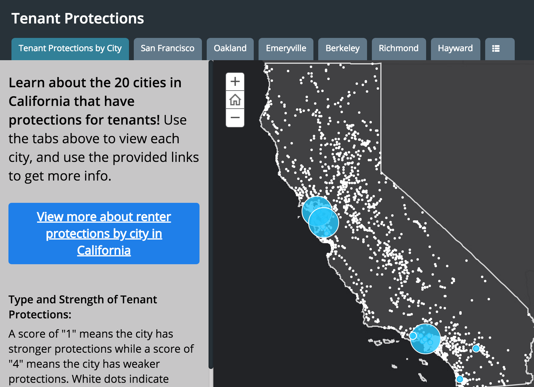
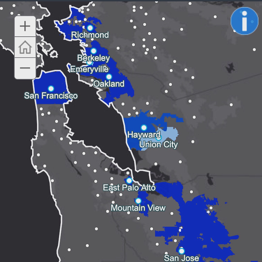 Tenant Protections by City: This map looks at the presence and strength of tenant protection policies
city-by-city, as well as giving a look at the presence [or lack there of] these policies across California.
Tabs allow viewers to get an in depth look at each city's policies, and access to more information.
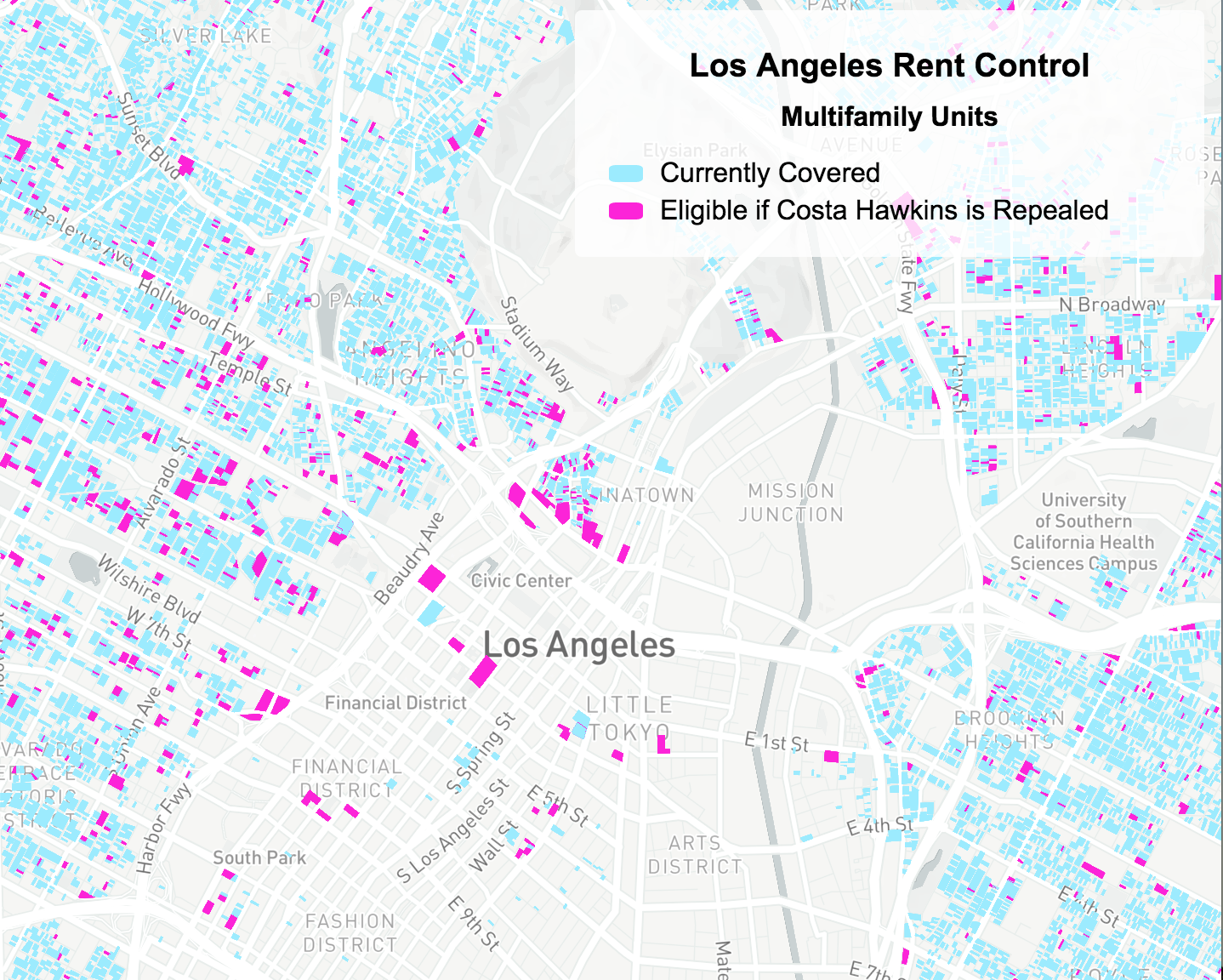 Los Angeles Rent Control Coverage by Unit: This map displays multifamily units that are currently covered under
Los Angeles rent control policy in contrast to the units that would be eligible for coverage if the Costa Hawkins Act is repealed.
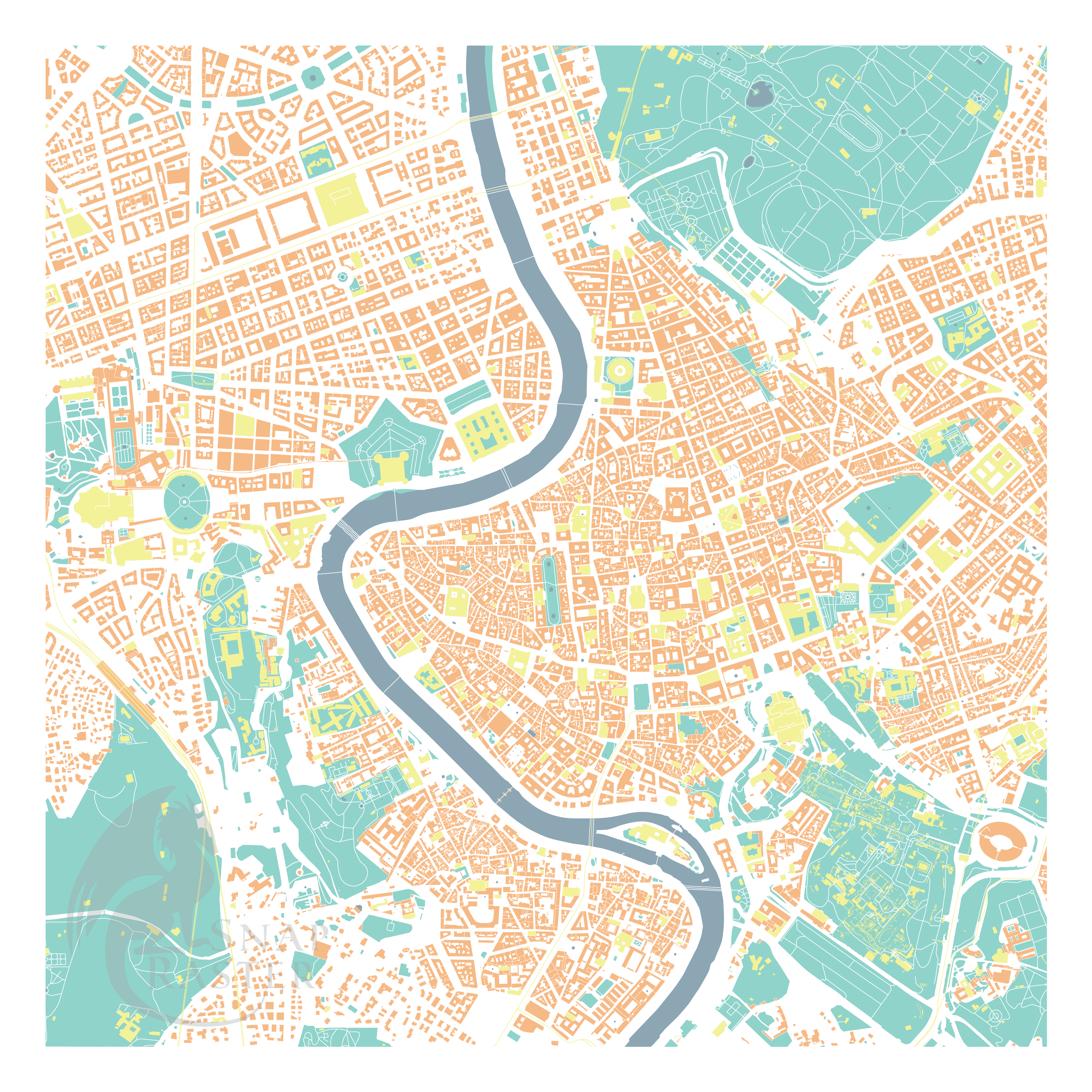
I created Snap Raster Cartography to produce and share maps focused on people's spatial knowledge of a place. Viewers are challenged to use their familiarity with geographic features to orient themselves and navigate the map.
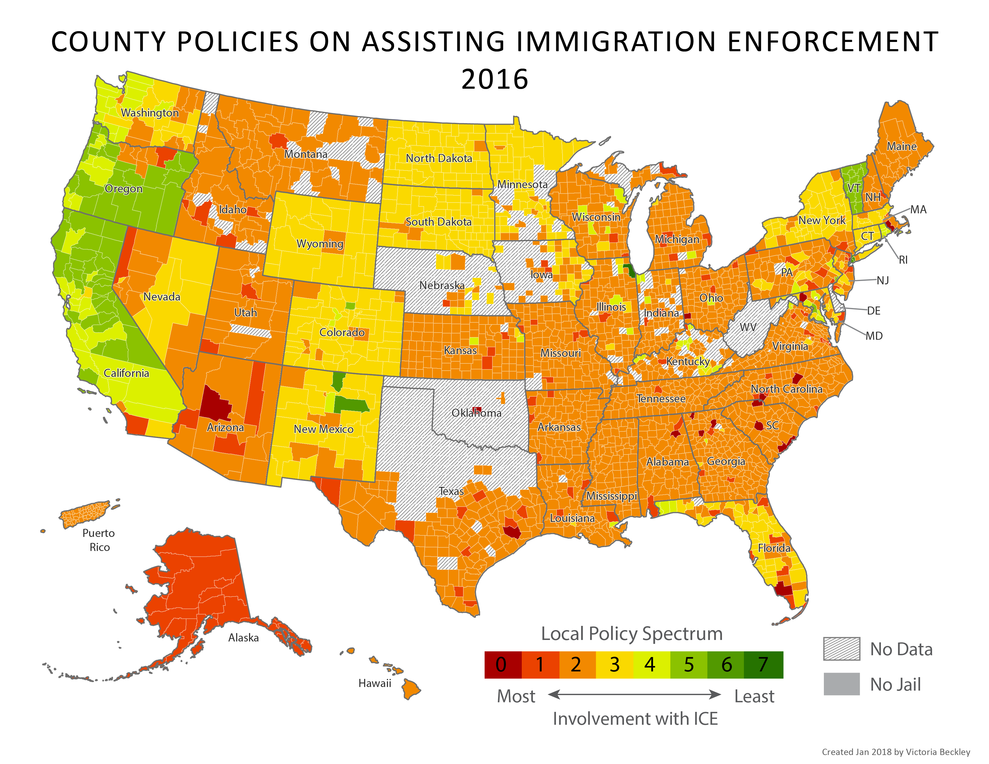
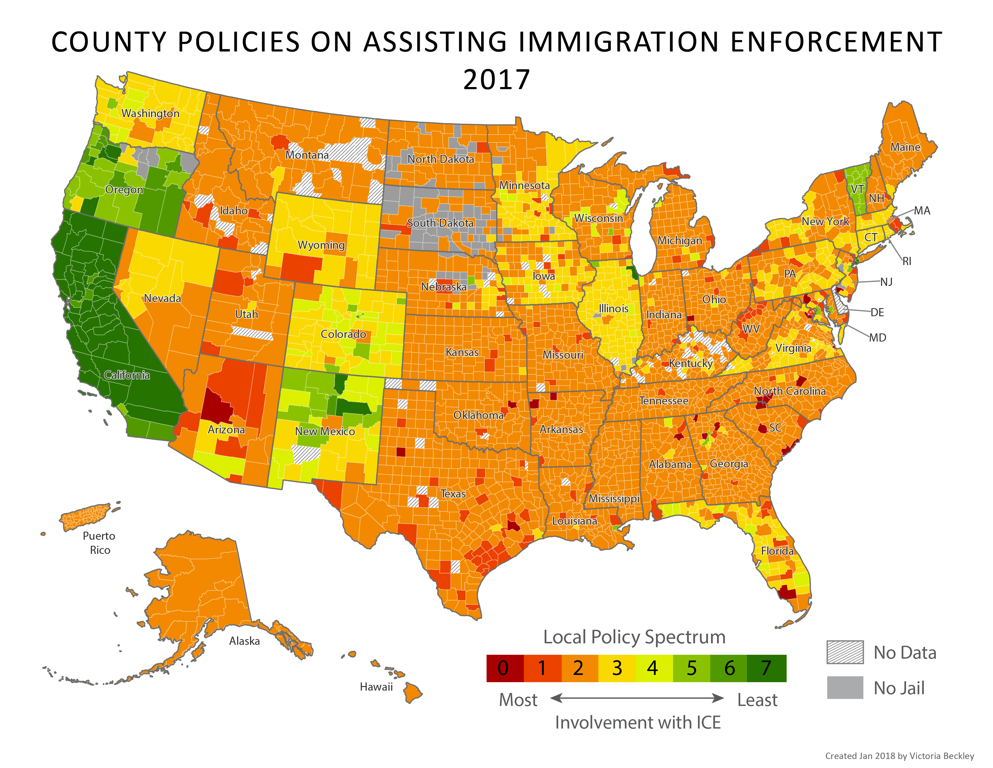
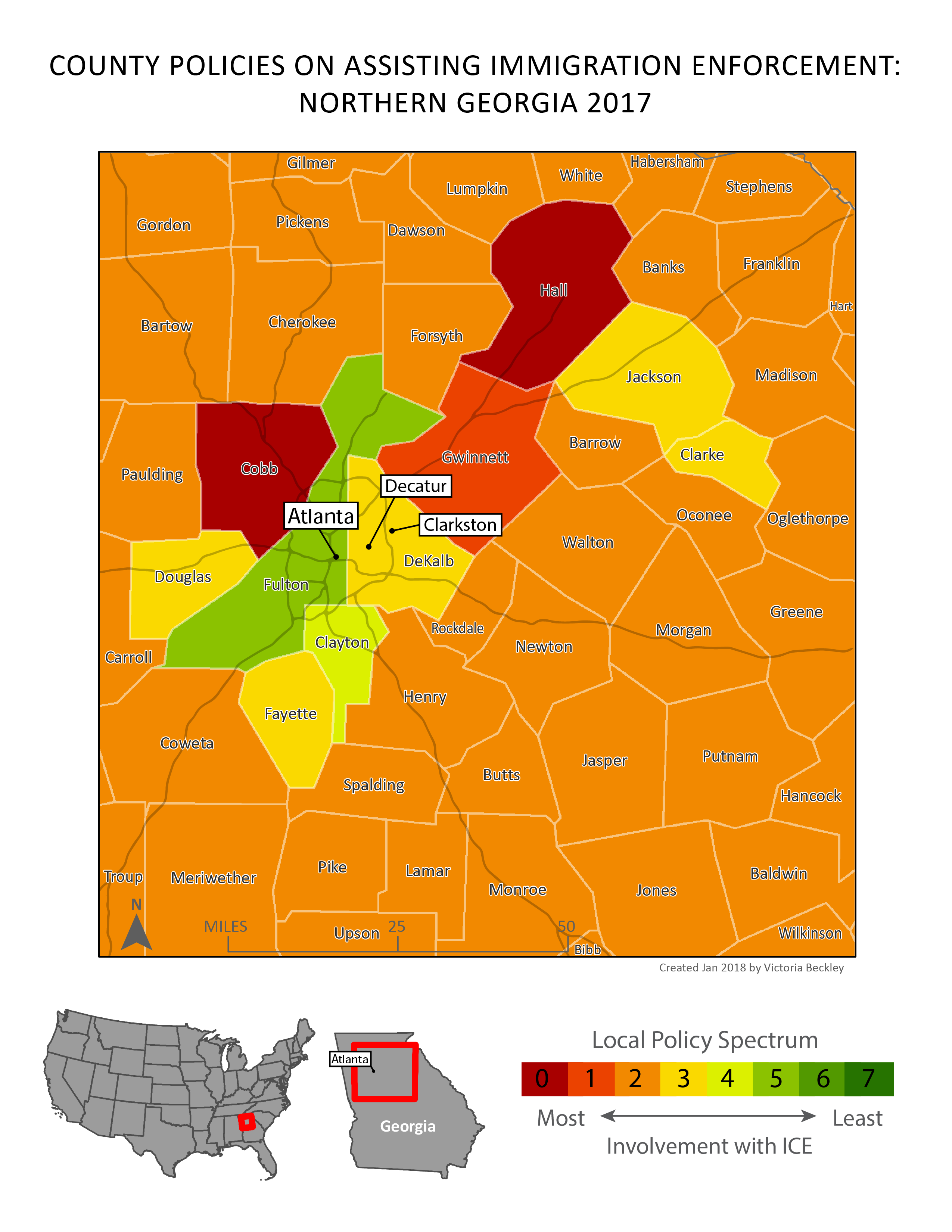
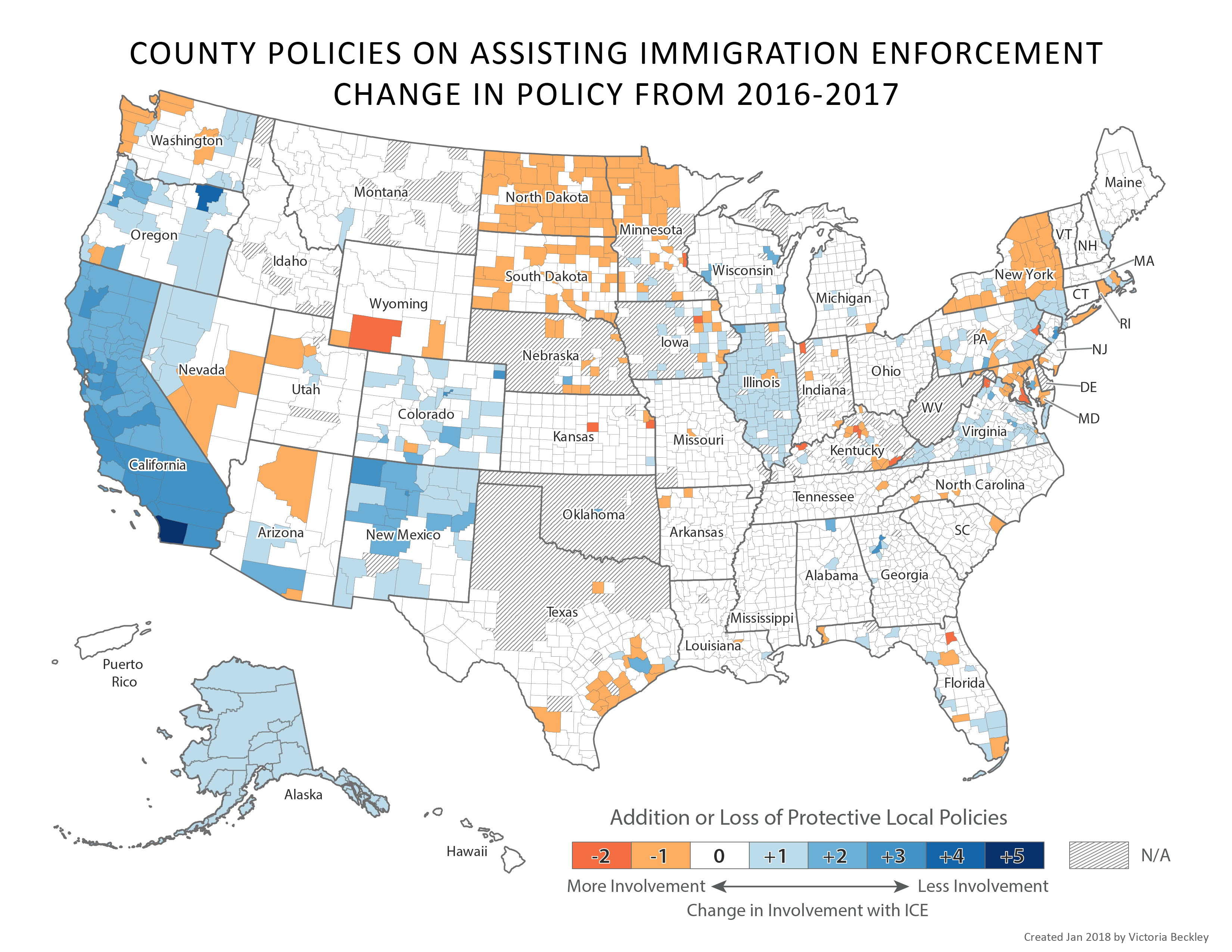
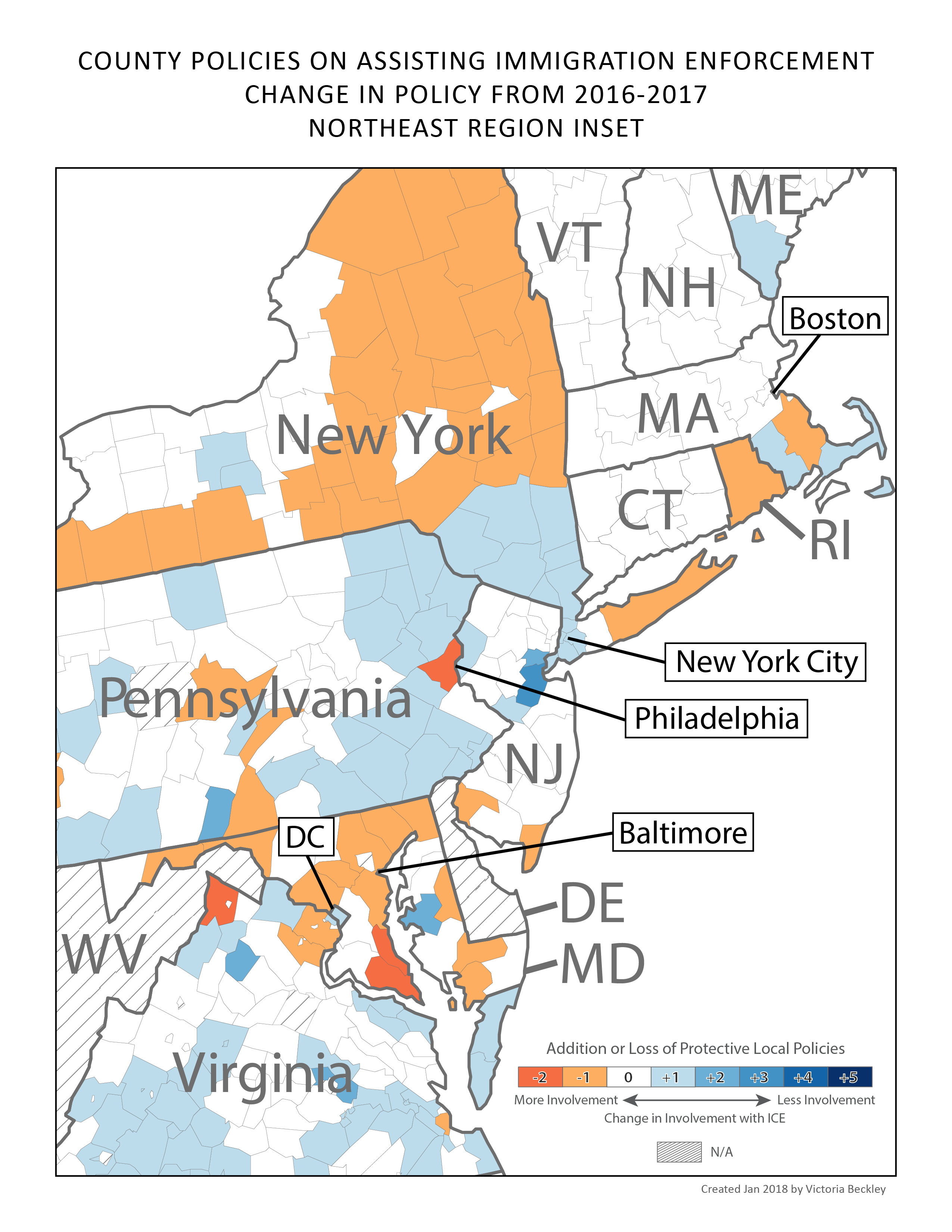
I collaborated with Immigration Legal Resource Center (ILRC) to contribute maps to their 2017 and 2018 reports on county policies pertaining to Immigration Enforcement across the country.
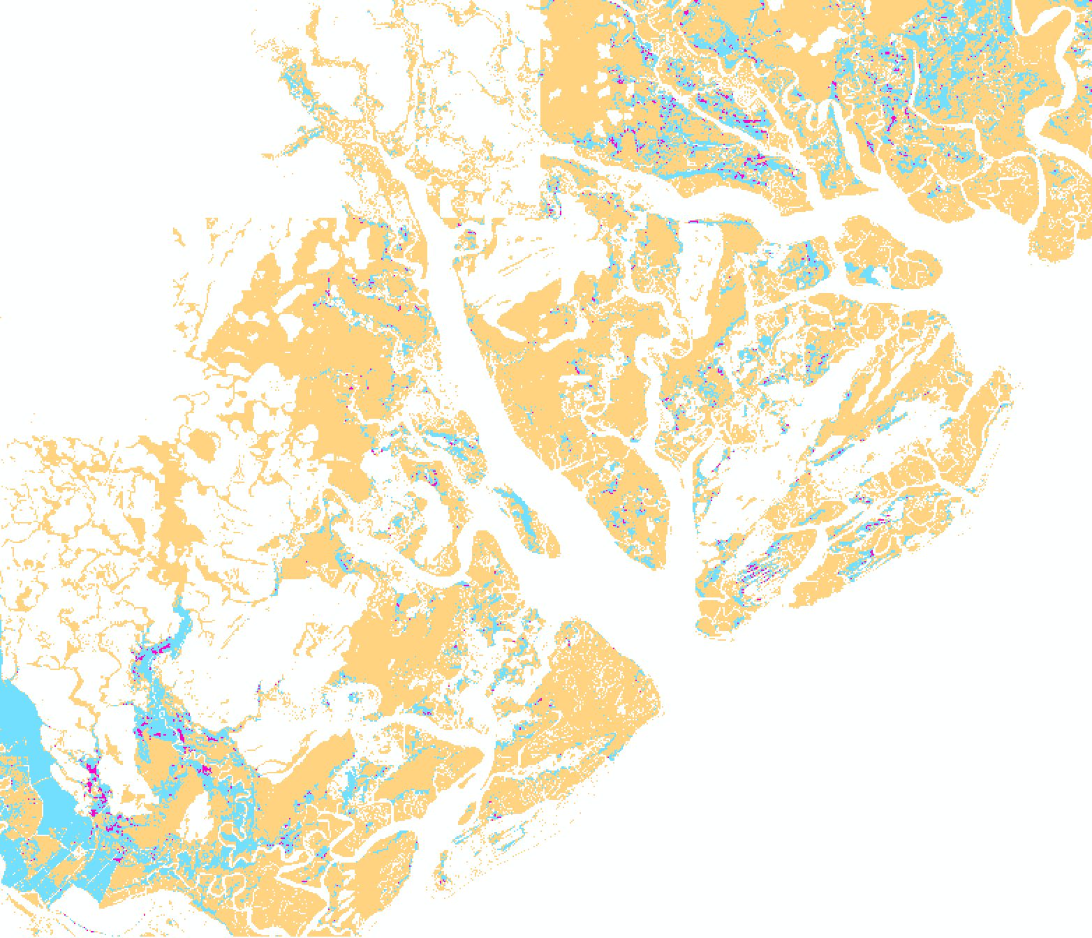
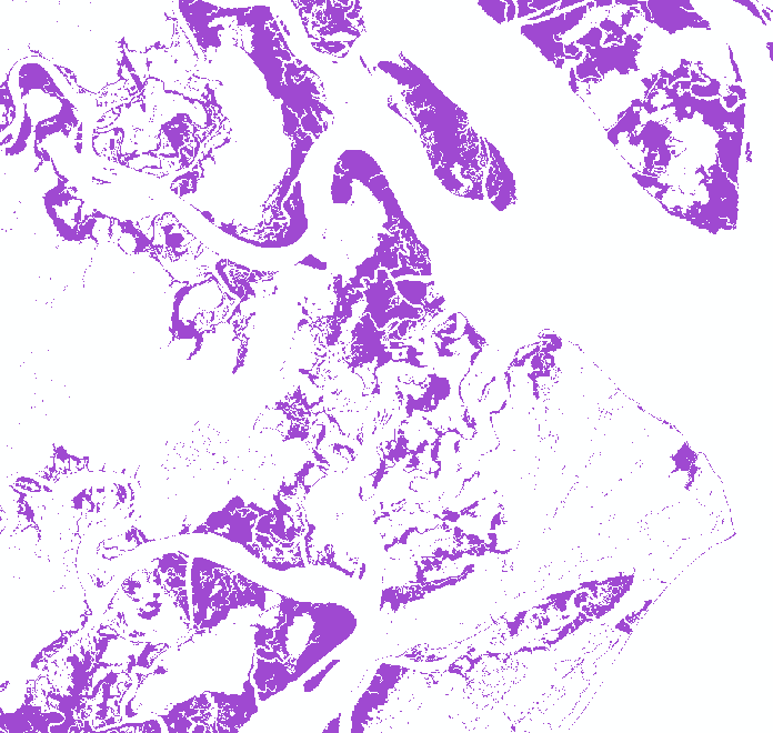
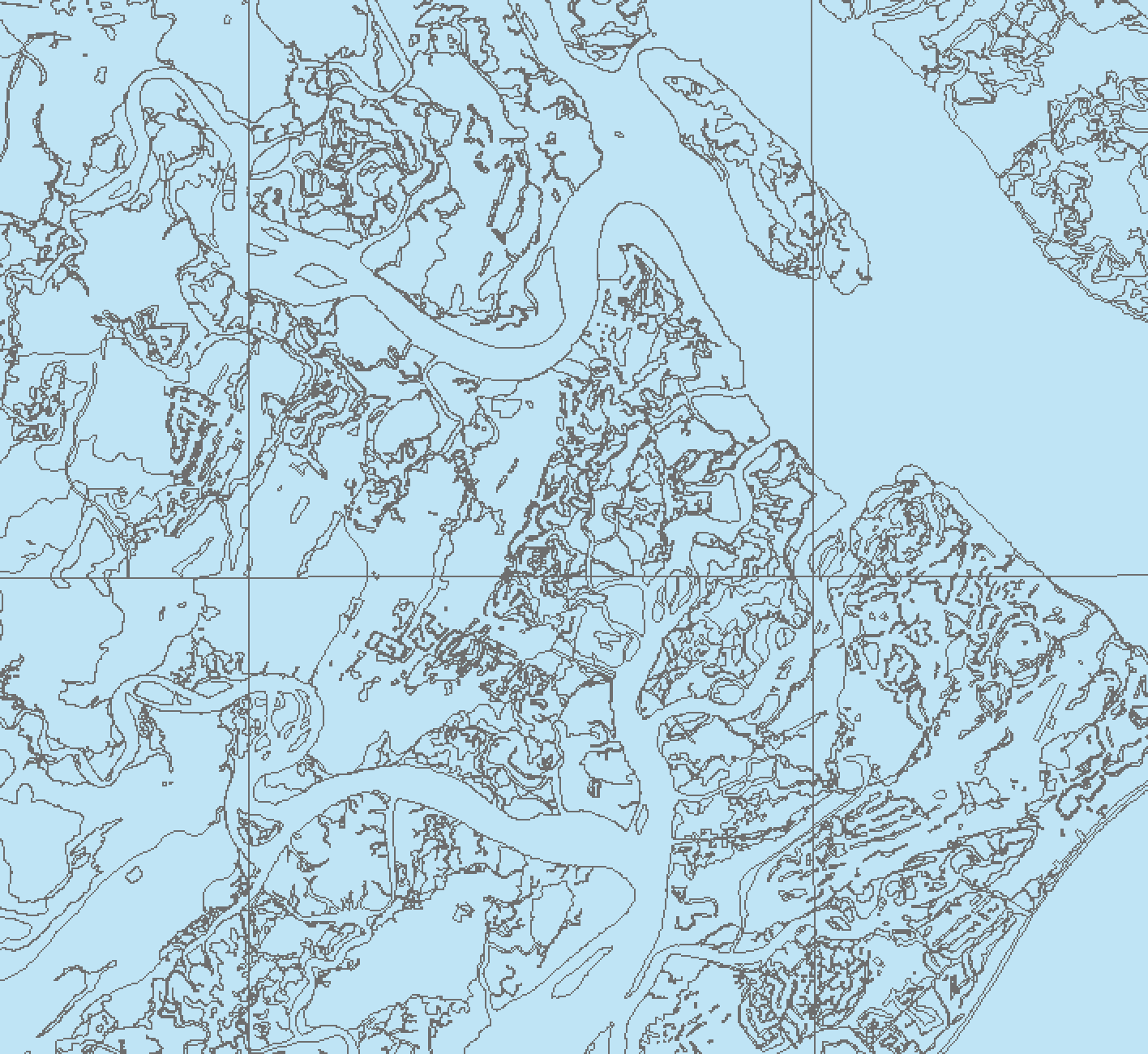
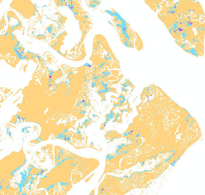
The Audubon South Carolina is interested in identifying land most conducive to future marsh migration for conservation purposes, and in 2015 contracted me to map these areas. The project overlaid four inputs to identify areas of highest and lowest likelihood of future marsh. These layers included landcover based on sea level rise, change in landcover using IPCC scenario predictions, soil data, and hardened shoreline features. The results helped inform the Audubon's land acquisition efforts.
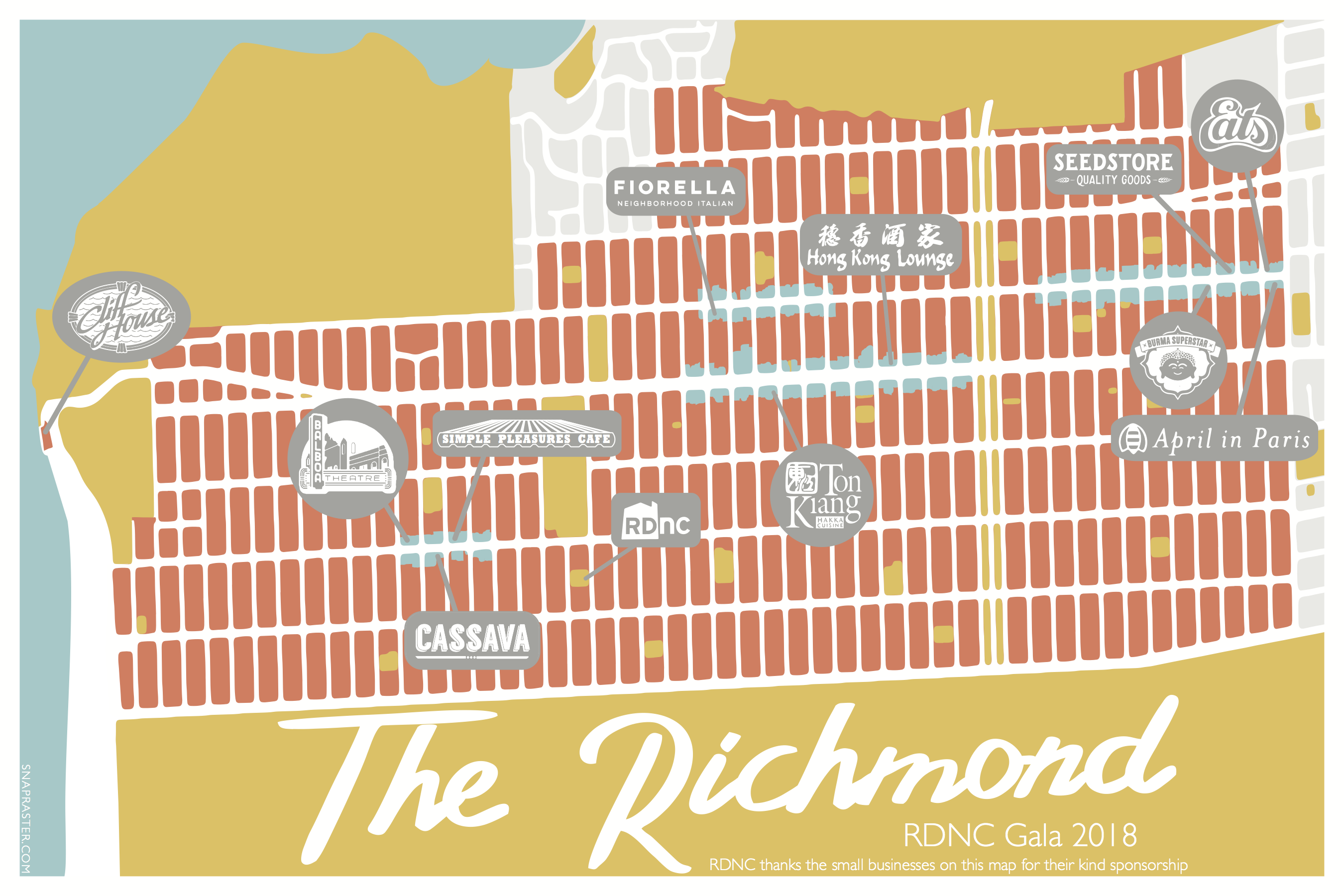
The Richmond Neighborhood Center (formerly Richmond District Neighborhood Center (RDNC)) commissioned me to make a commemorative map that was given to guests of their 2018 fundraising Gala. The map highlighted the sponsors of the event as staple local businesses that help define the Richmond district.
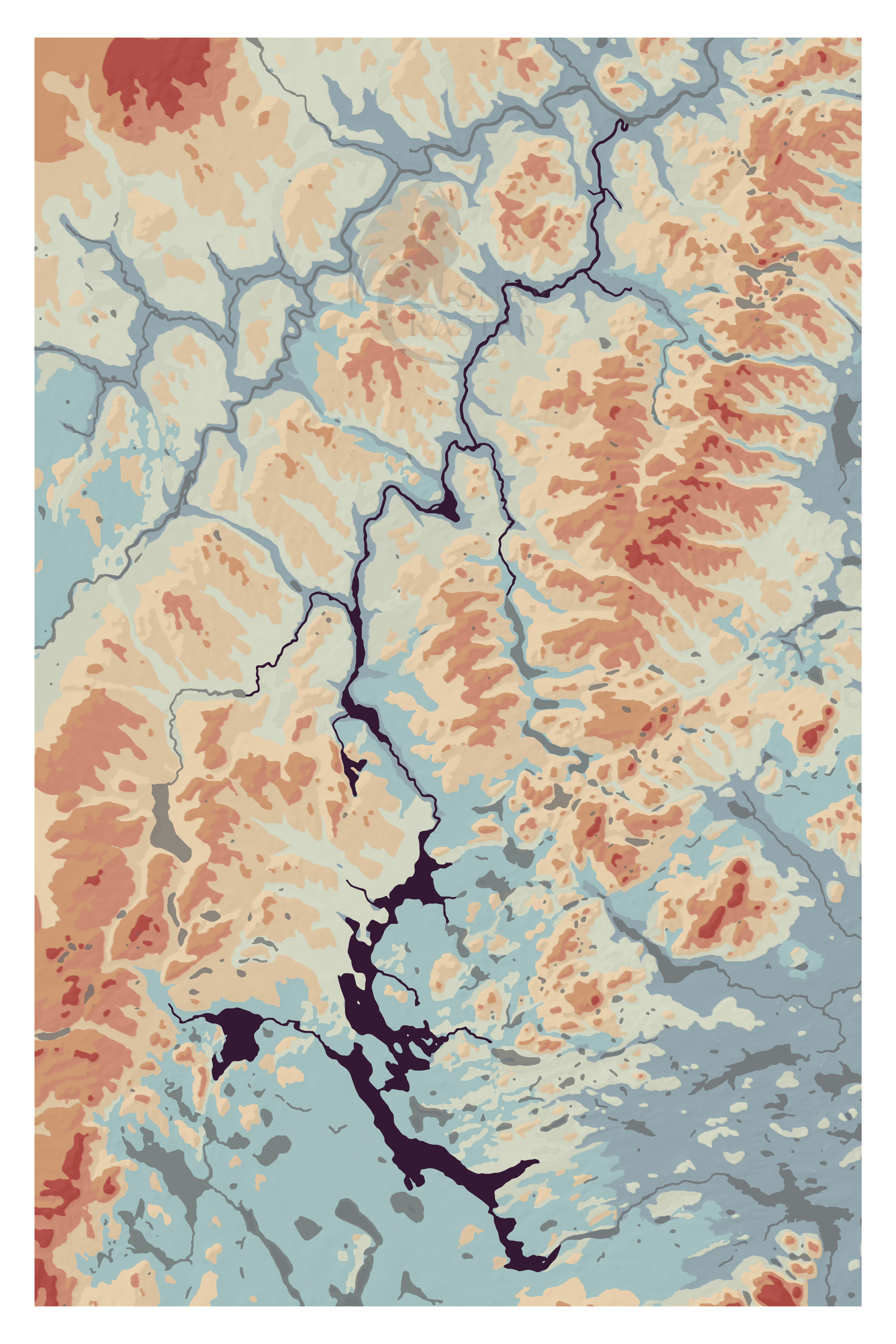
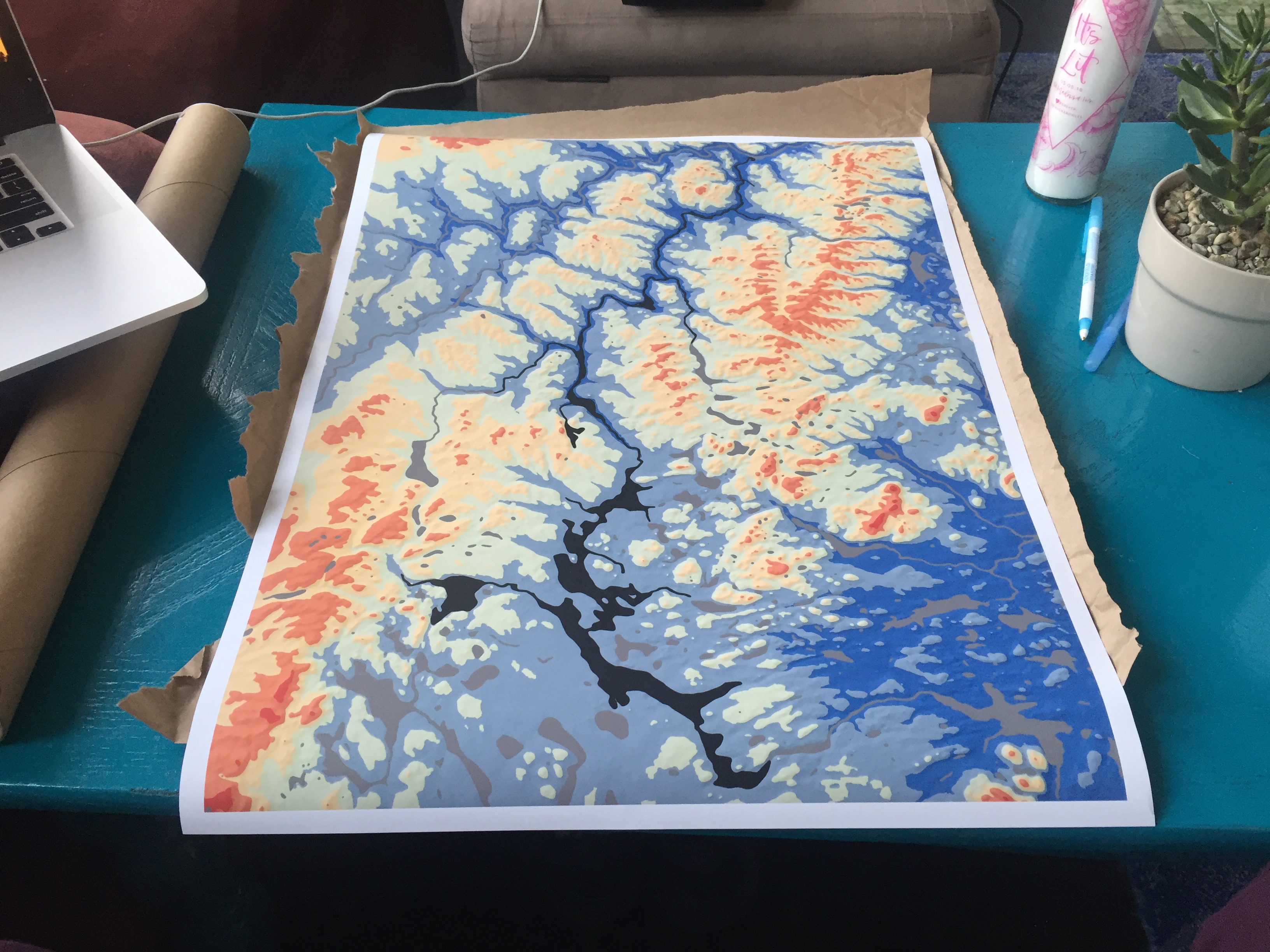
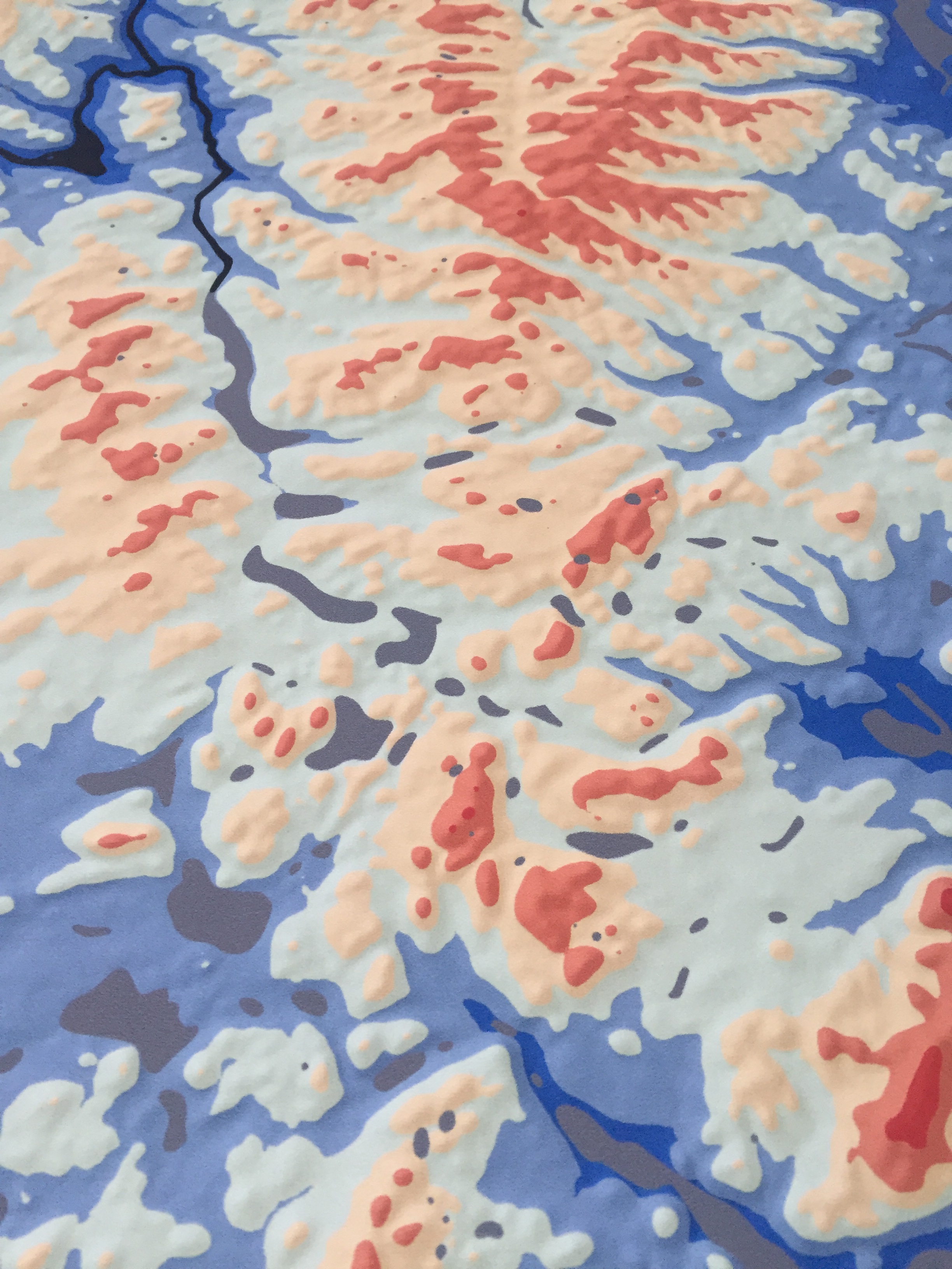
I made this map for my friend's dad who leads an annual kayaking trip down the Allagash. The map's focus in on the river so that those familiar with it can recognize locations based on its bends and forks, I also included the surrounding elevation (topography) for context and color. The topography is visualized using a digital elevation model (DEM) from the Maine Office of Geographic Information Systems. I classified and colored the DEM and then generated a hillshade to overlay, helping distinguish the valleys and ridges of the terrain.

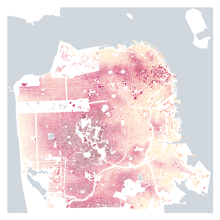
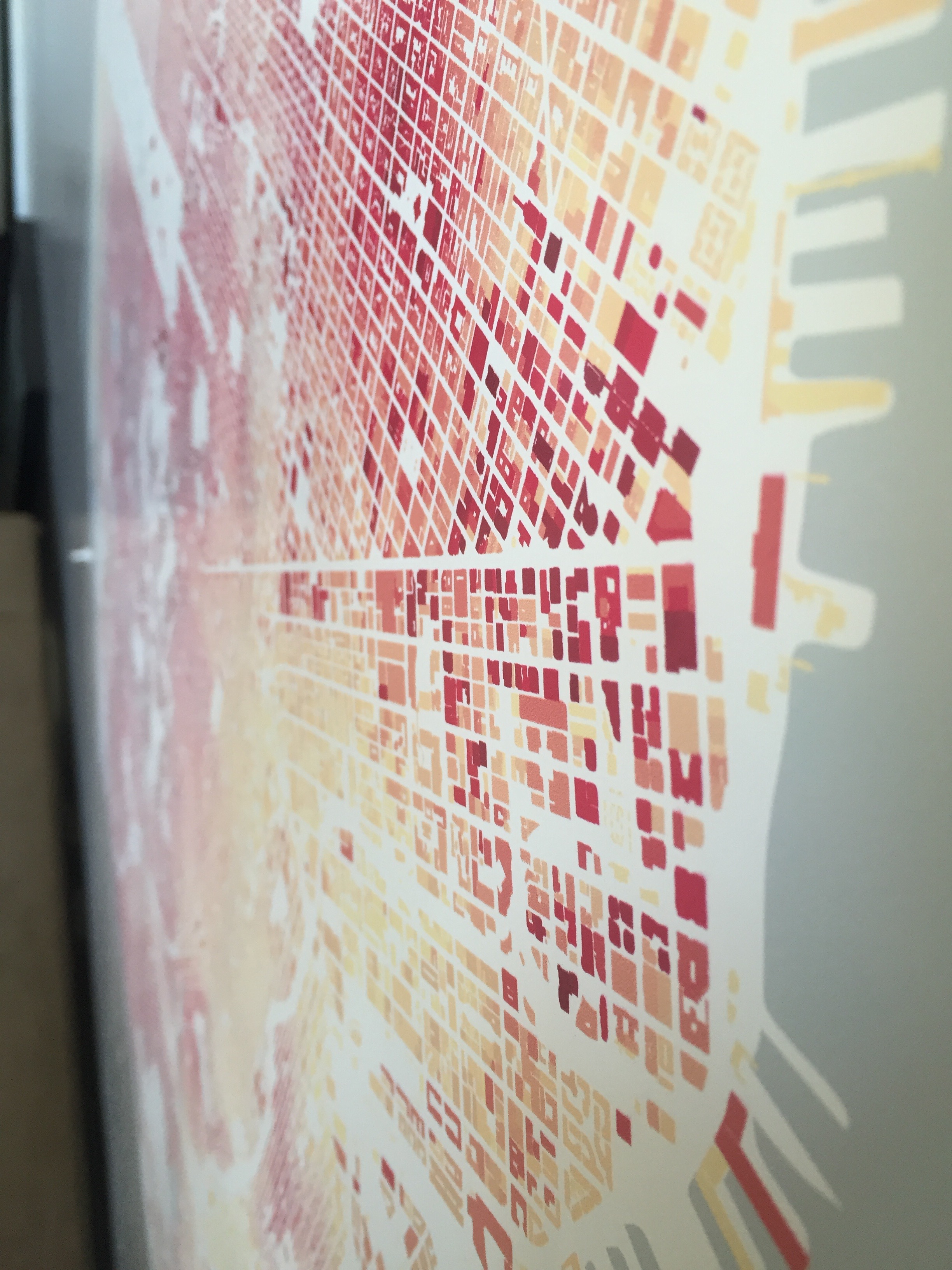
This map uses a digital elevation model (DEM) from the City of San Francisco to visualize the highest point above sea level on each building in the city. This allows viewers to recognize skyscrapers in downtown as well as hills and valleys across San Francisco. I used the DEM to assign values to the buildings using the maximum z value within the building footprint's extent. I then assigned a range of colors to these values to indicate the elevation, the highest point on the spectrum representing 1776 feet at Sutro Tower, and the lower point at 8 feet, in Hunters Point.

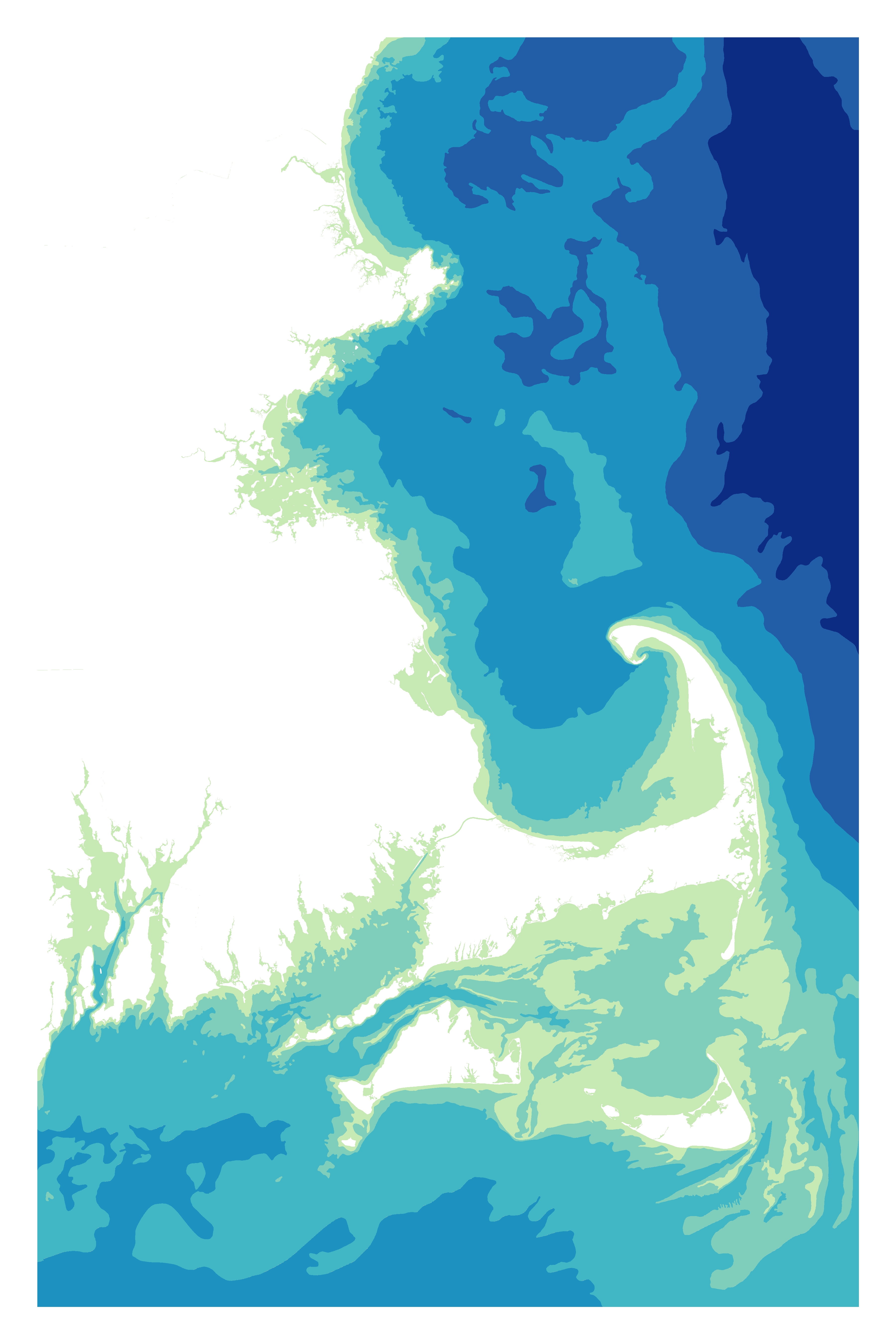
I wanted to map the coastline of Cape Cod because of its unique shape that defines Massachusetts. This map illustrates the Atlantic Ocean using various color spectrums to show water depth, or bathymetry. This allows viewers to use the water to identify coastal features along Cape Cod, Nantucket, the Vineyard, and Boston Harbor.
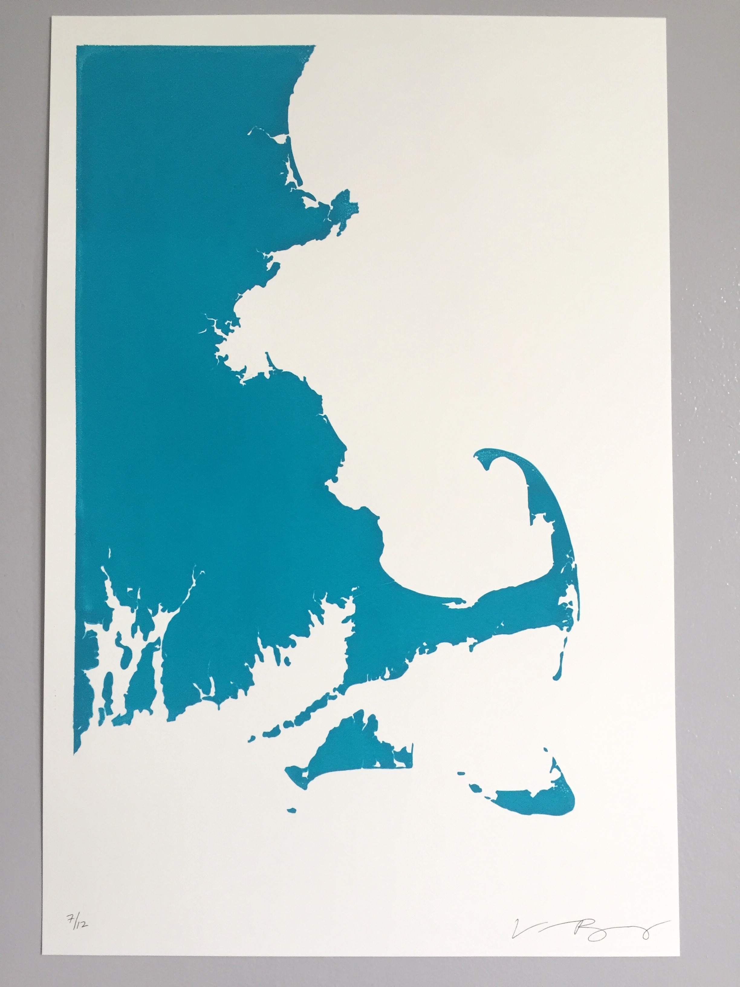
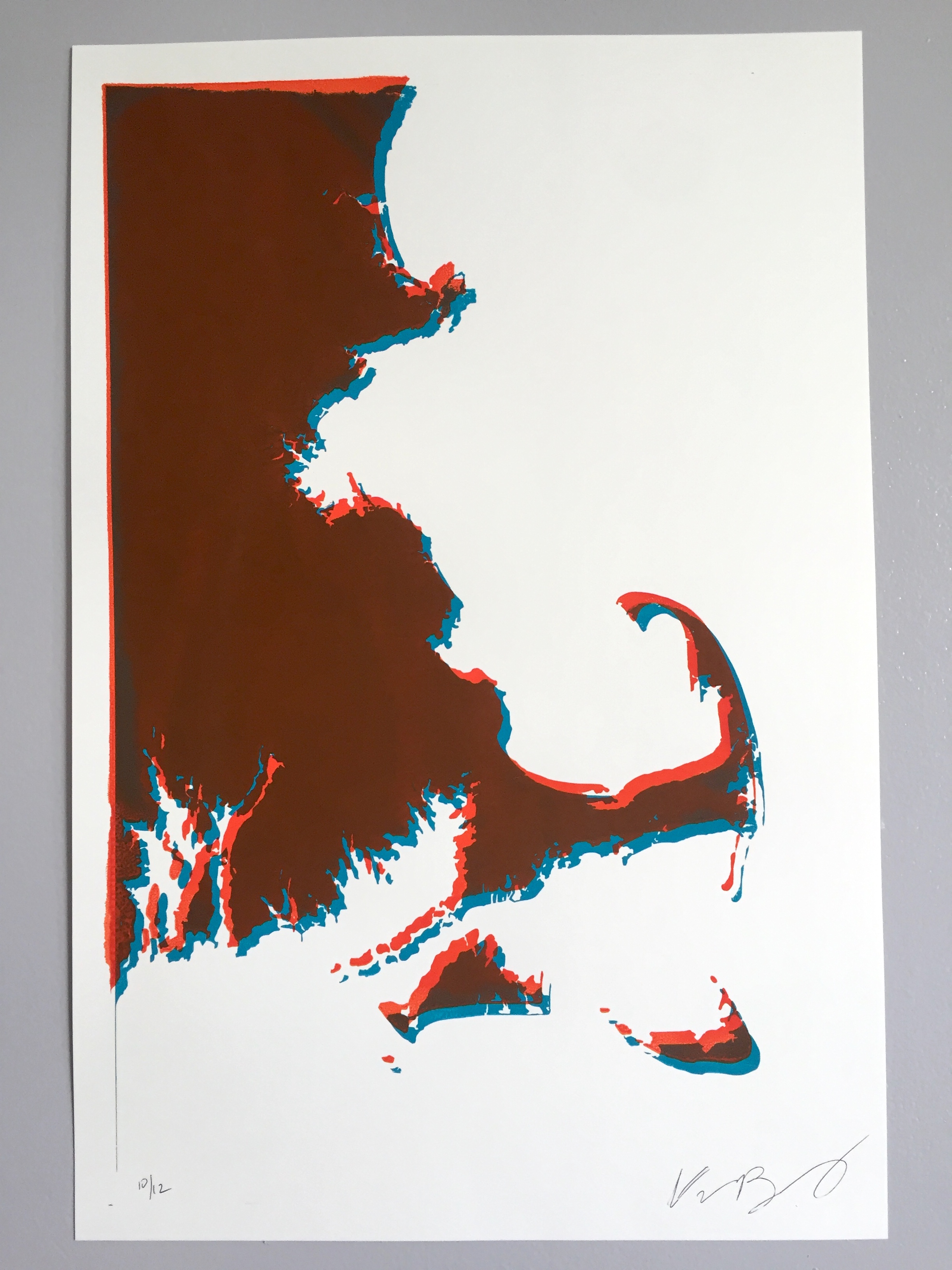
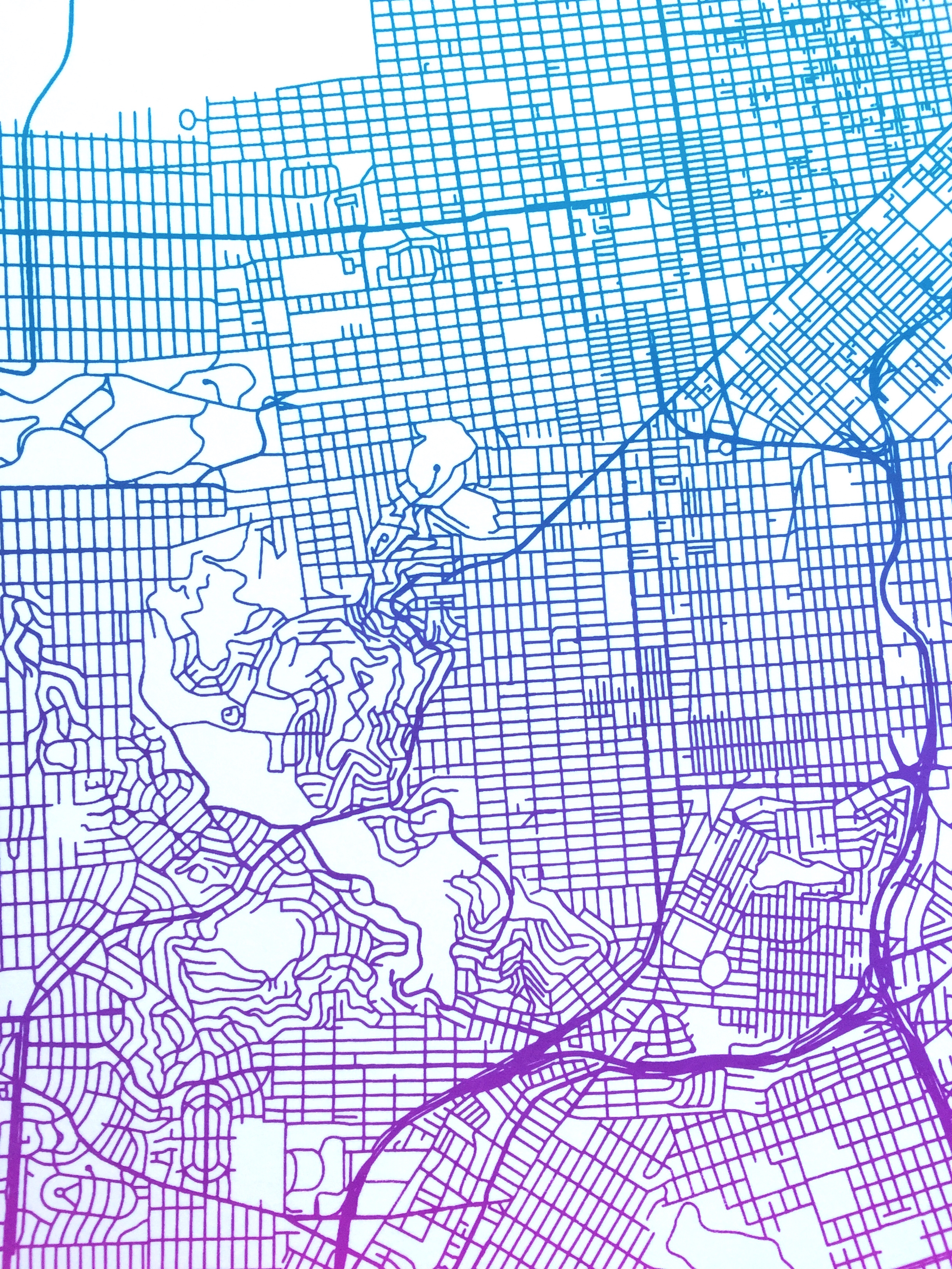
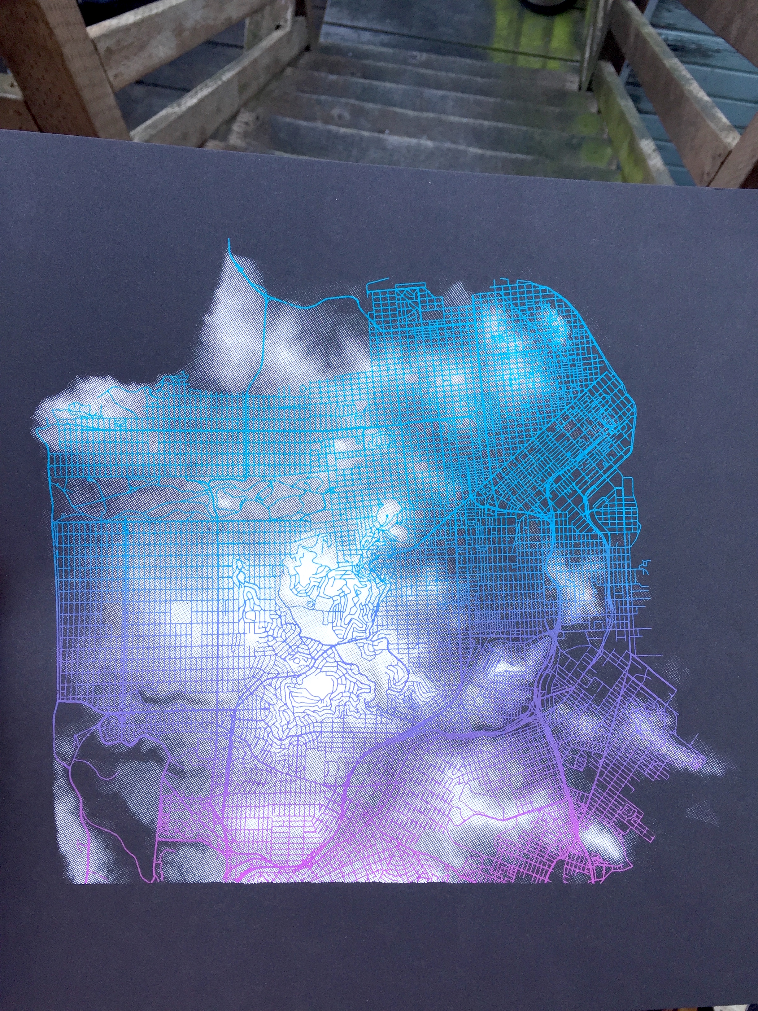
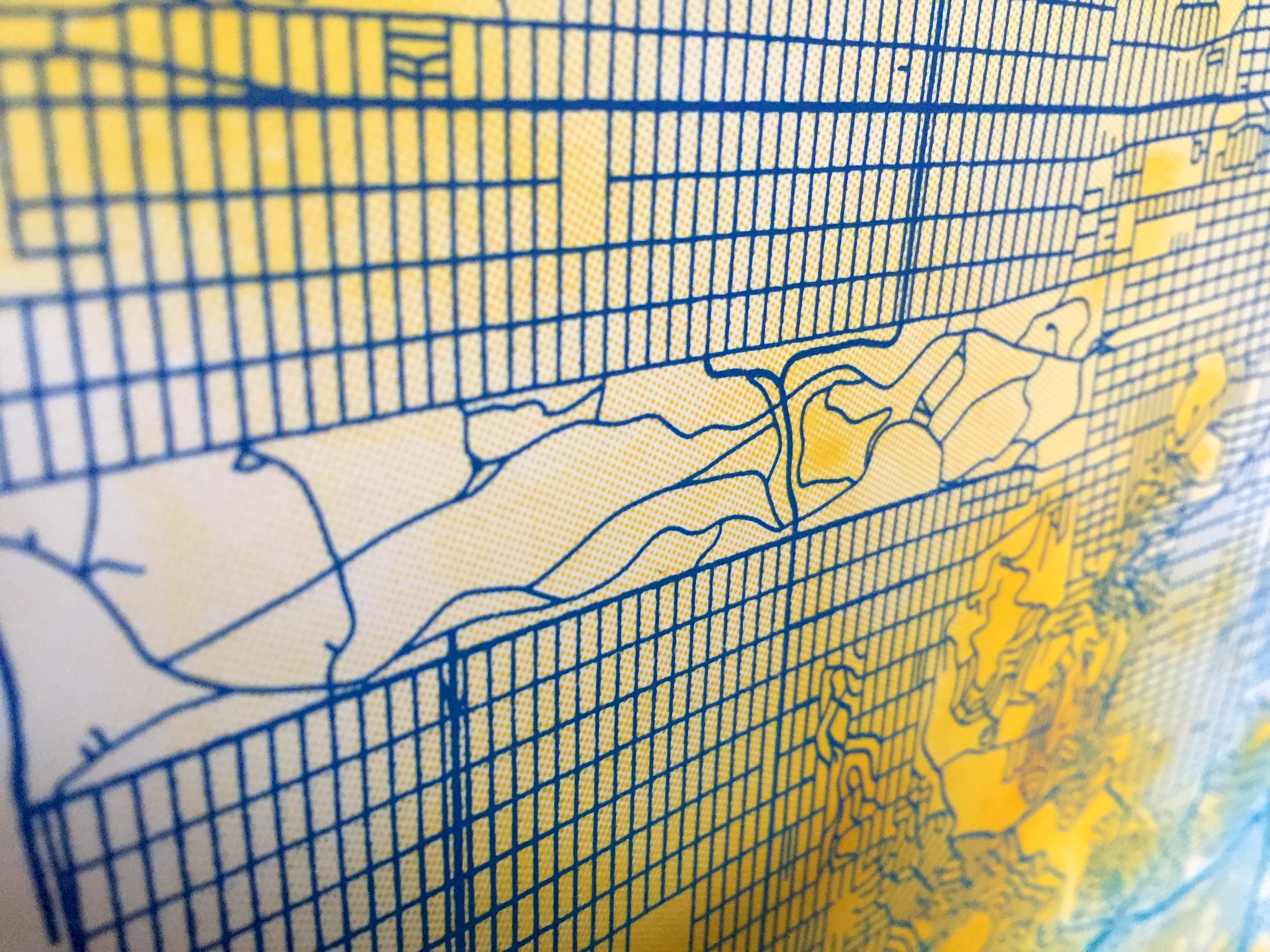
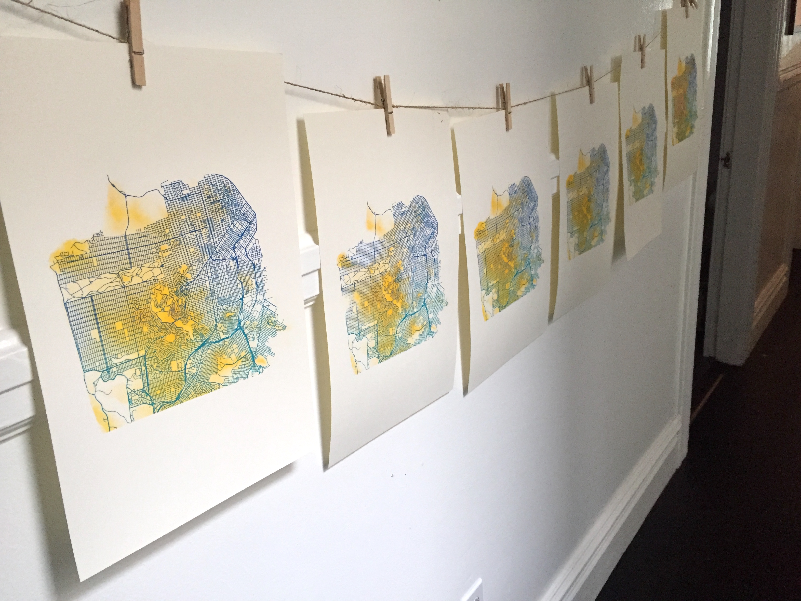
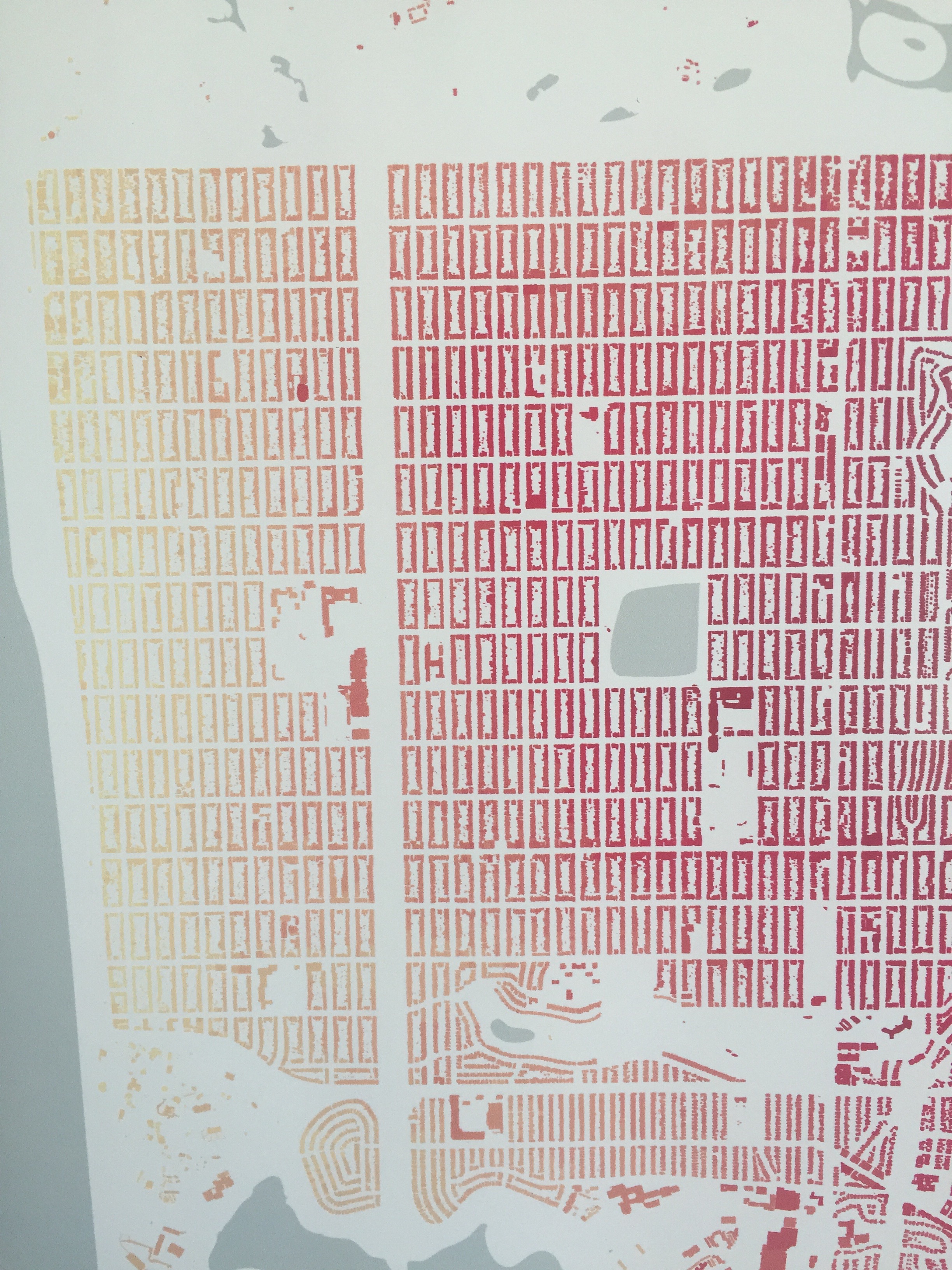
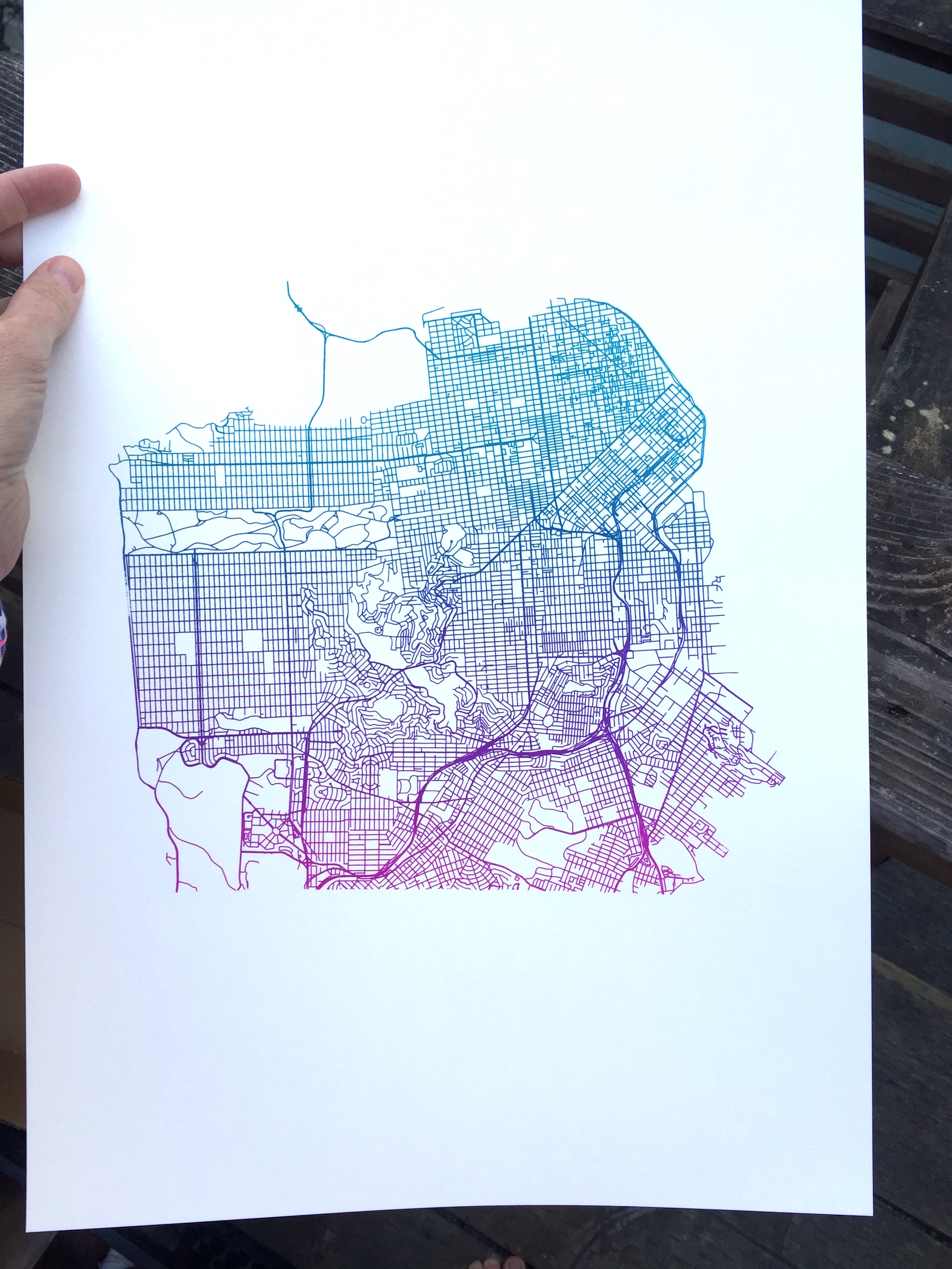
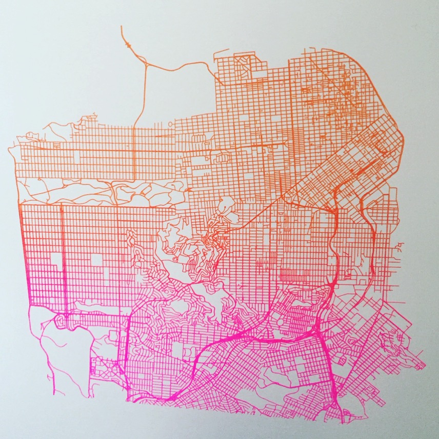
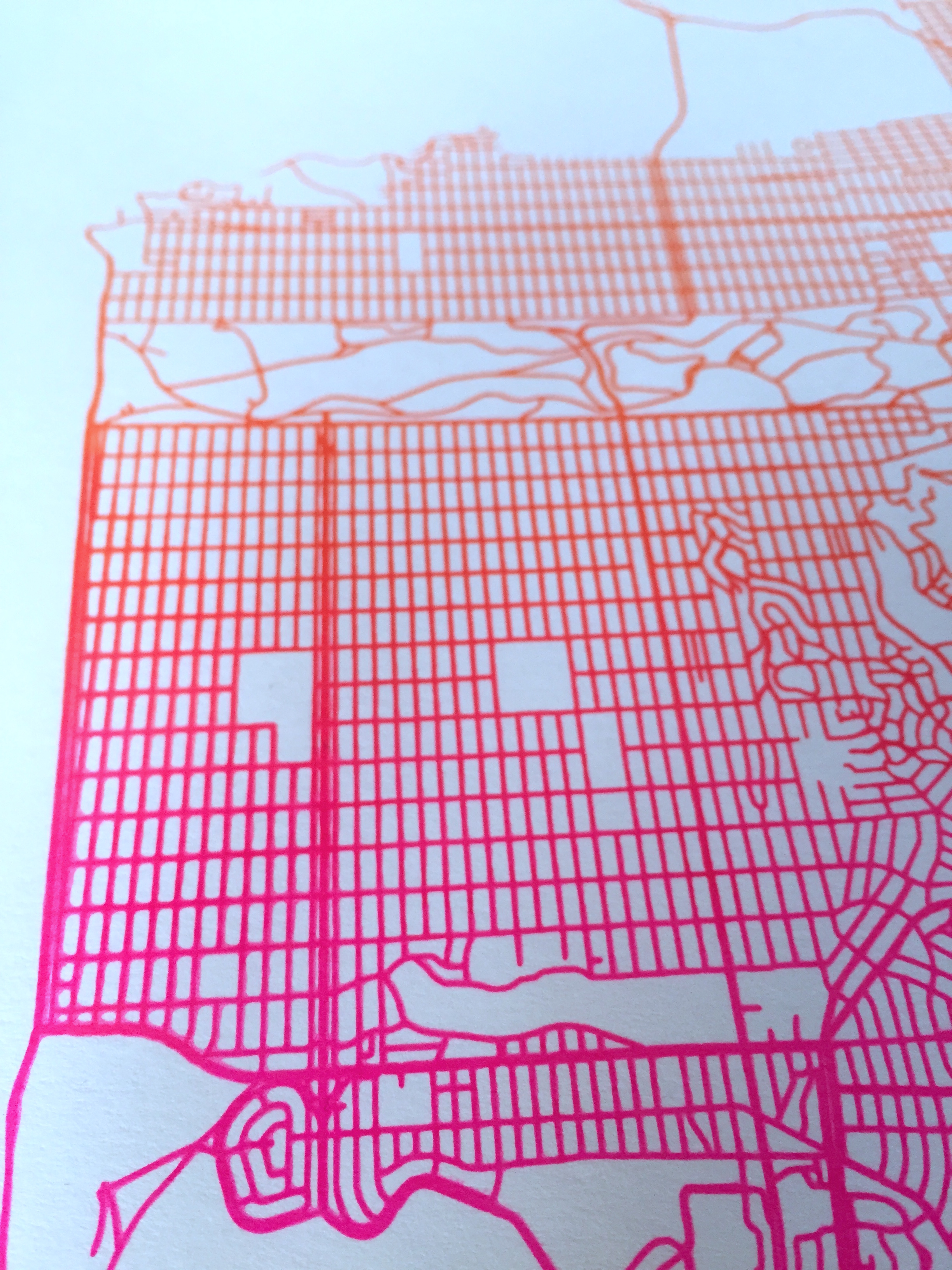
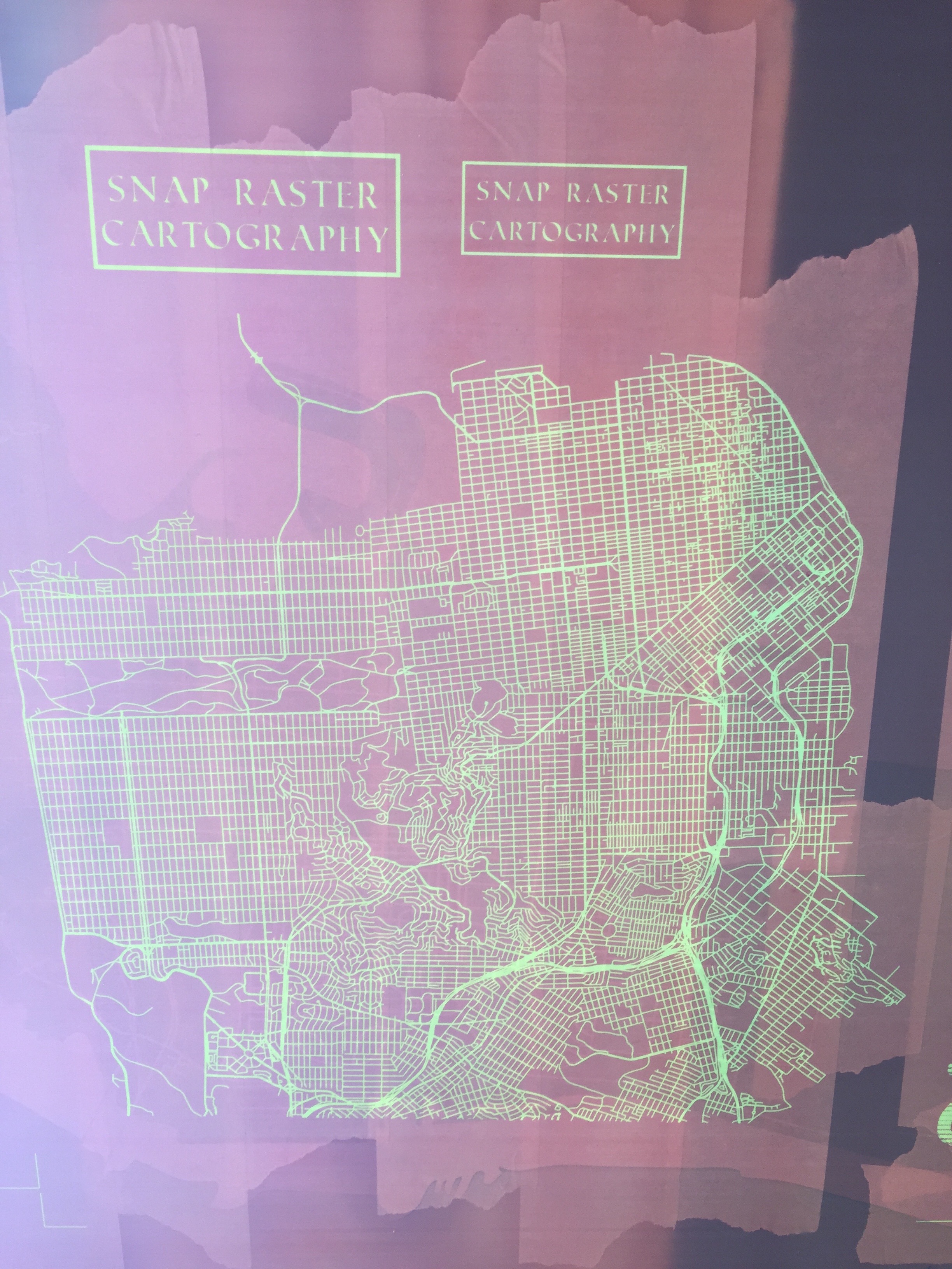
This is a screen print of the streets of San Francisco, done using a color gradient, or split fountain, printing technique. I am particularly drawn to the streets because their shape helps convey the hills, windy streets indicate steep areas, while straight lines are typically flat areas.
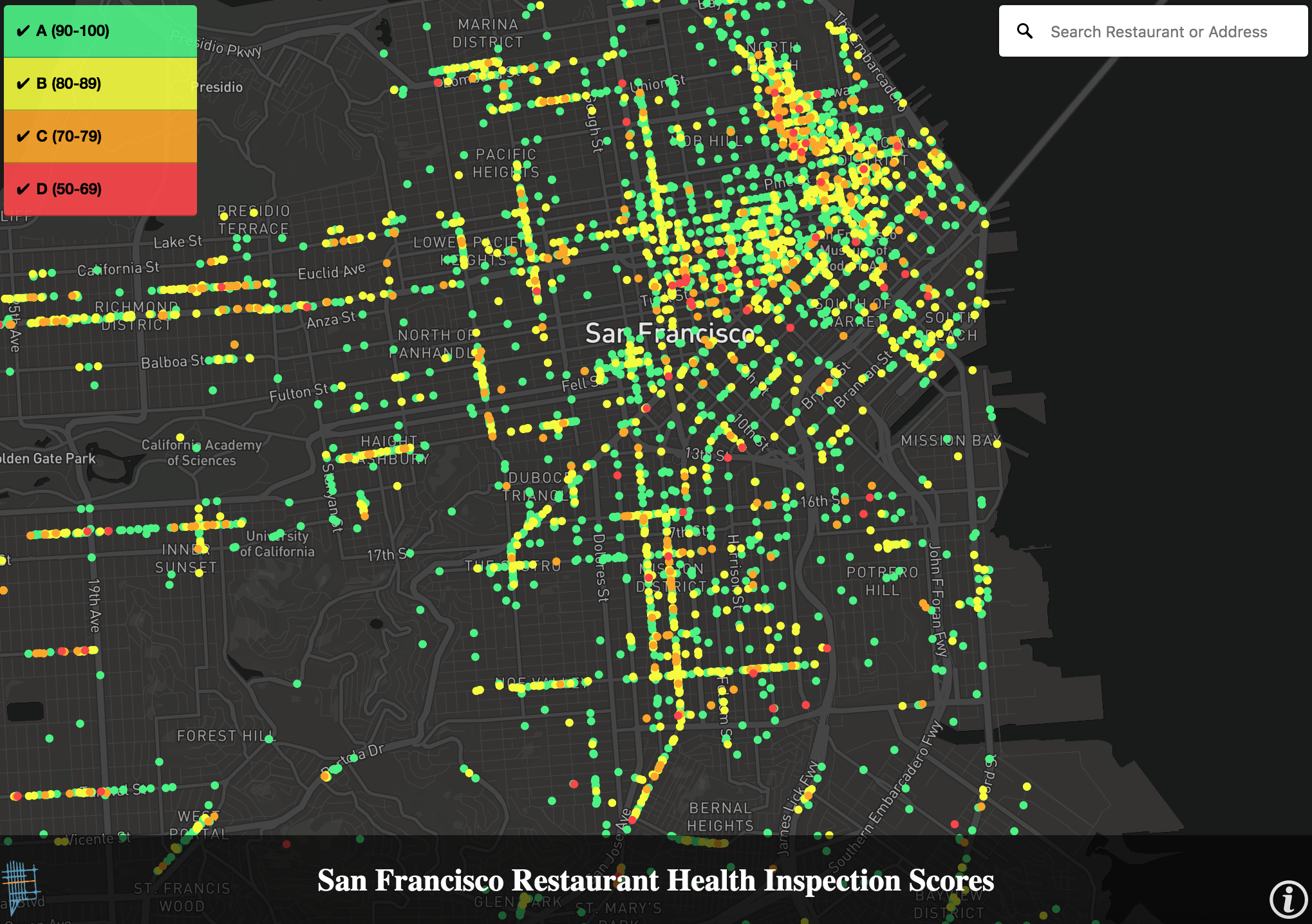
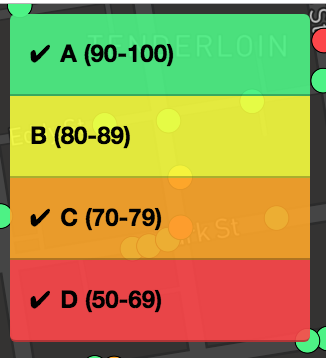
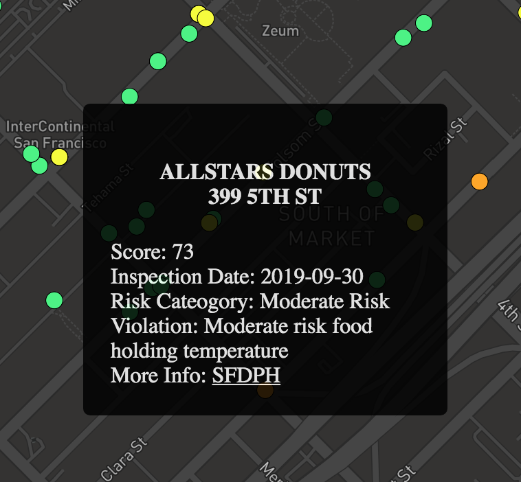
This map was created for Mission Local to make current restaurant inspection scores more accessible to residents (see this article on the lack of transparency in restaurant scores in SF).
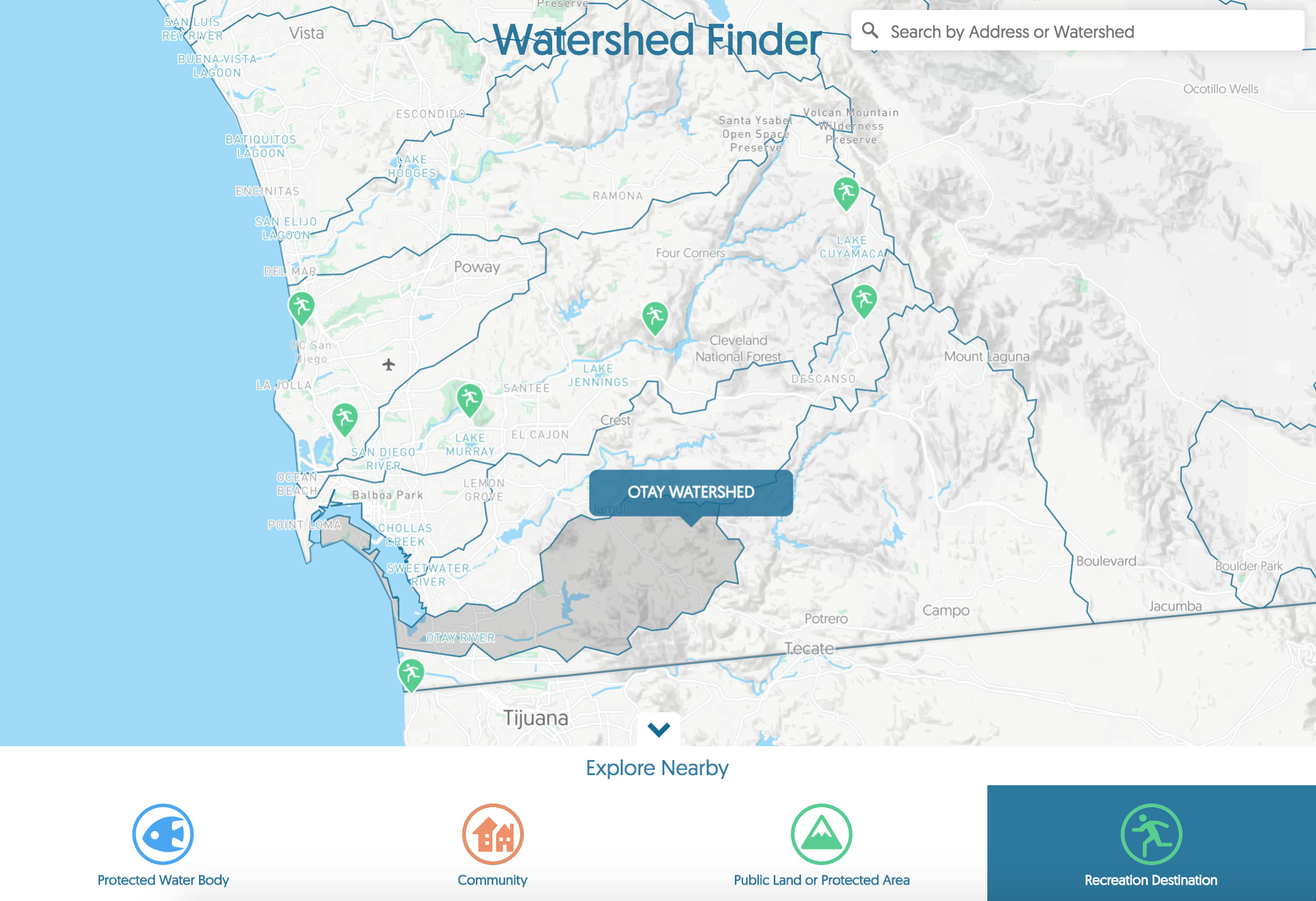
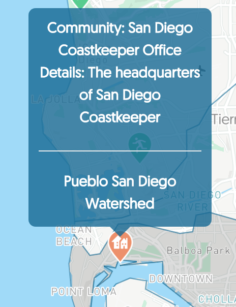
This map was made for San Diego Coastkeeper to visualize watersheds in the San Diego region to help inform locals of the watershed in which they work and live in order to encourage protection of water bodies.


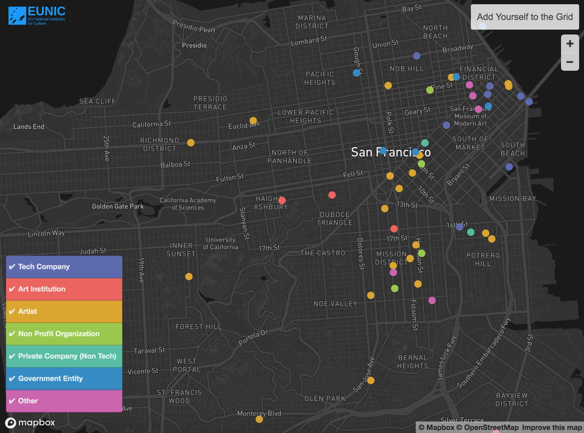
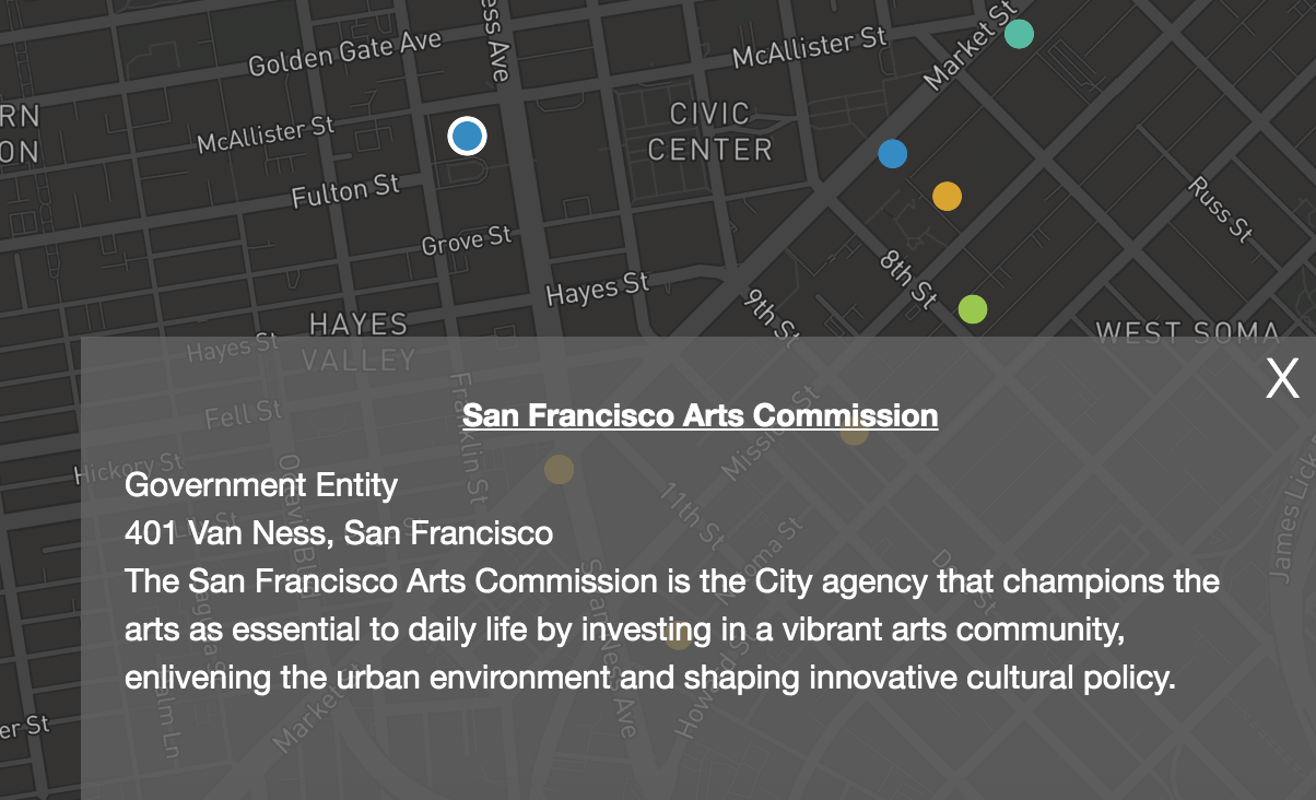
The grid is a new initiative sponsored by the EU National Institues for Culture (EUNIC) to map out and analyze the intersections of art and technology in the Bay Area. This map was produced for the first iteration of the project as a way to let stakeholders identify themselves and connect with others in their area.
